Case study · Loyalty & rewards
TapTap
A loyalty app that makes earning and redeeming points feel like play.
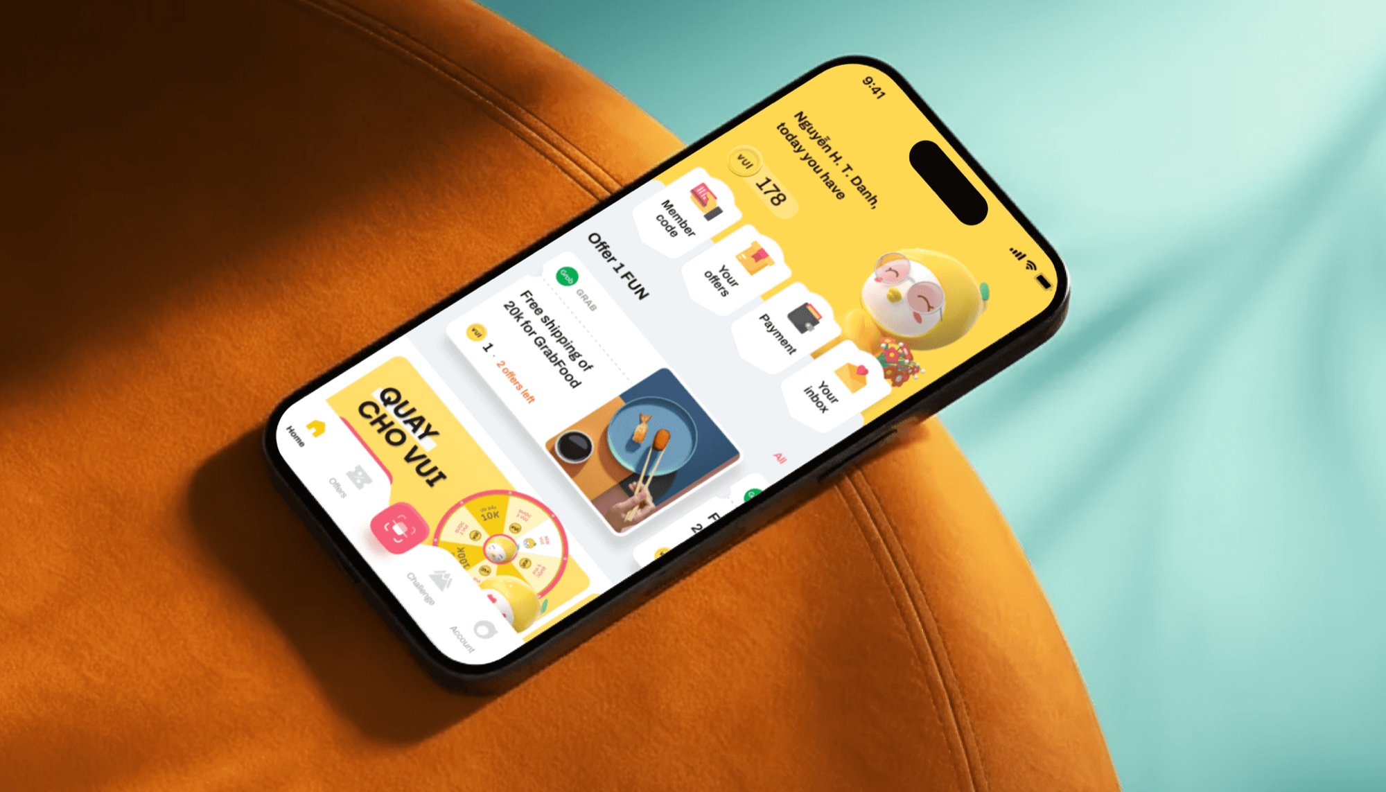
TAPTAP lets people earn points with partner brands and redeem them for deals. The goal was to raise product quality, sharpen the core experience and add light gamification for engagement and retention.
Working as a senior contractor alongside the UX, product and engineering teams, we shaped the UX direction and delivered the UI.
Make earn, track and redeem obvious at a glance, and make the app feel joyful without looking like another coupon store.
- 01Refined user journeys with UX and product
- 02Put key value and core actions above the fold
- 03Designed progress, challenge and reward states
- 04Used mascots and 3D in a controlled way
- 05Built flexible UI patterns for campaigns
- 06Kept the app in step with the brand system
Points that people actually spend.
Product scaleTAPTAP product figures, as published in the case on phamhuyds.com.
First touchpoint
A welcome that ends with a gift.
Phone number, name, then a choice of four surprise gifts. New users earn their first points before they have read a single rule.
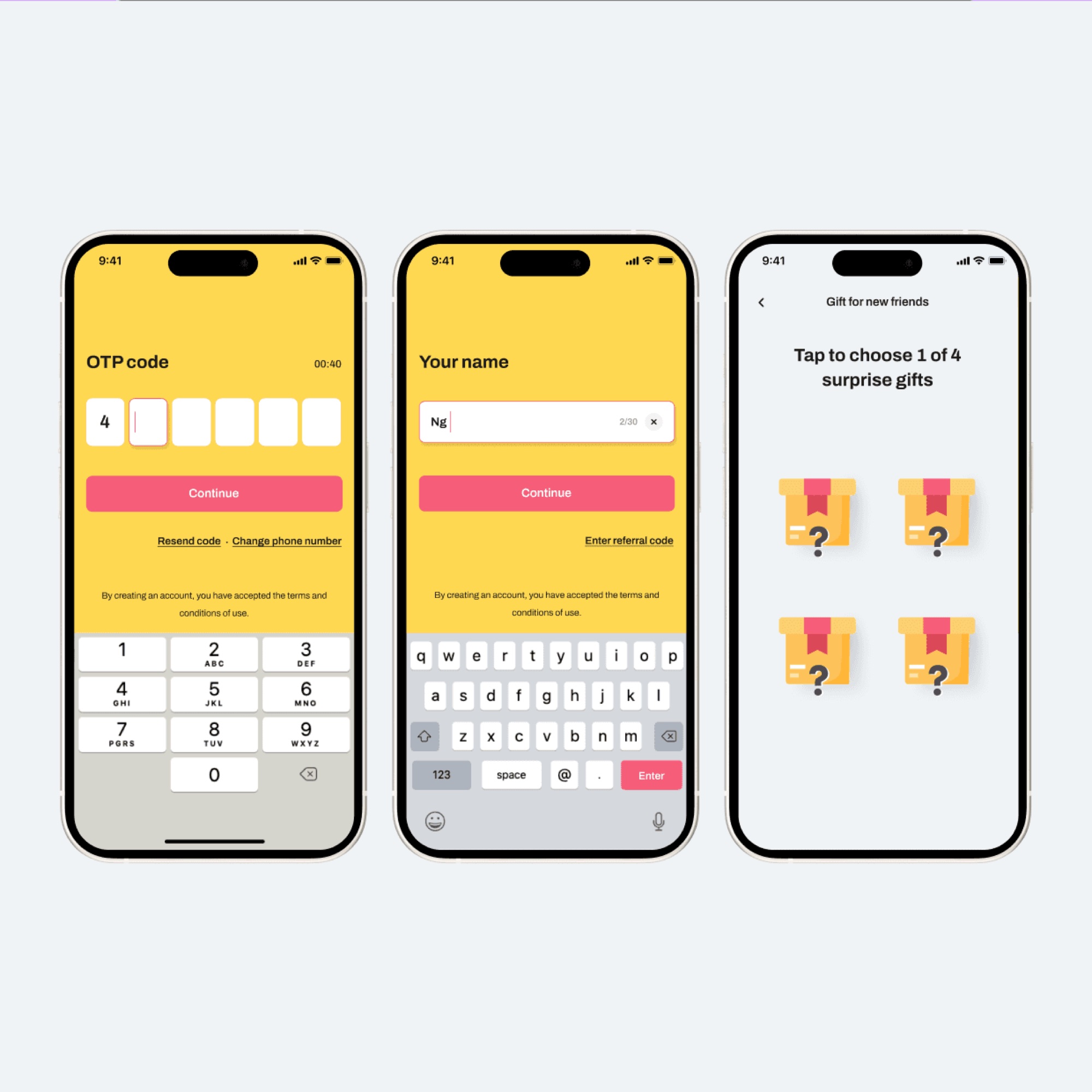
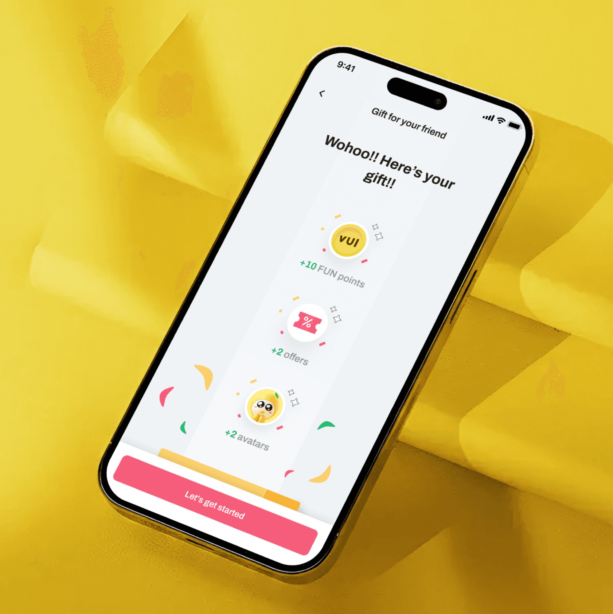
Onboarding in three steps, closing on the gift reveal.
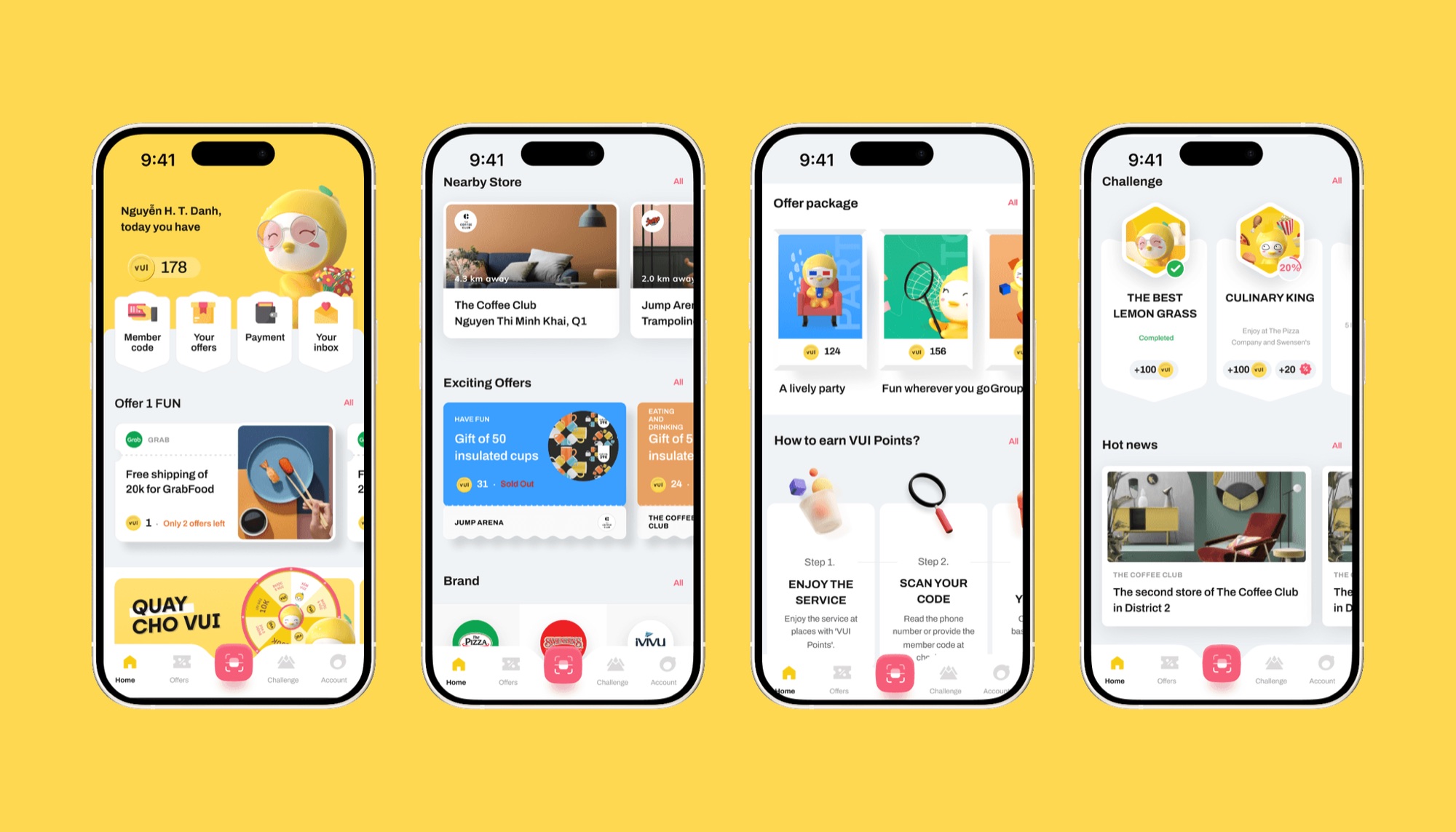
Home, nearby stores, offer packages and challenges.
Earn · Track · Redeem
The whole loop, one thumb away.
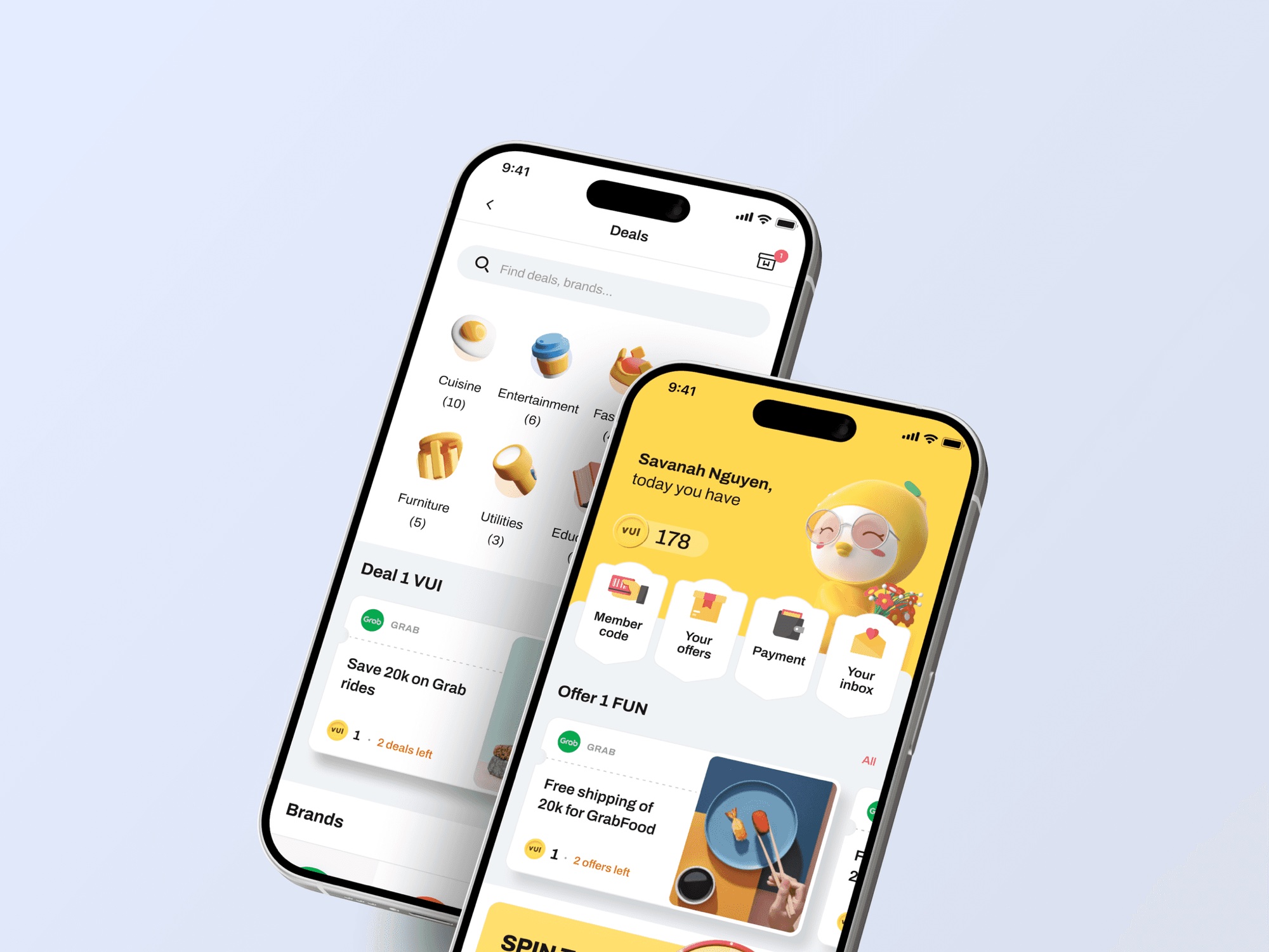
Deals sorted by what you can afford now. Every card shows the points needed, the deals left and the next step.
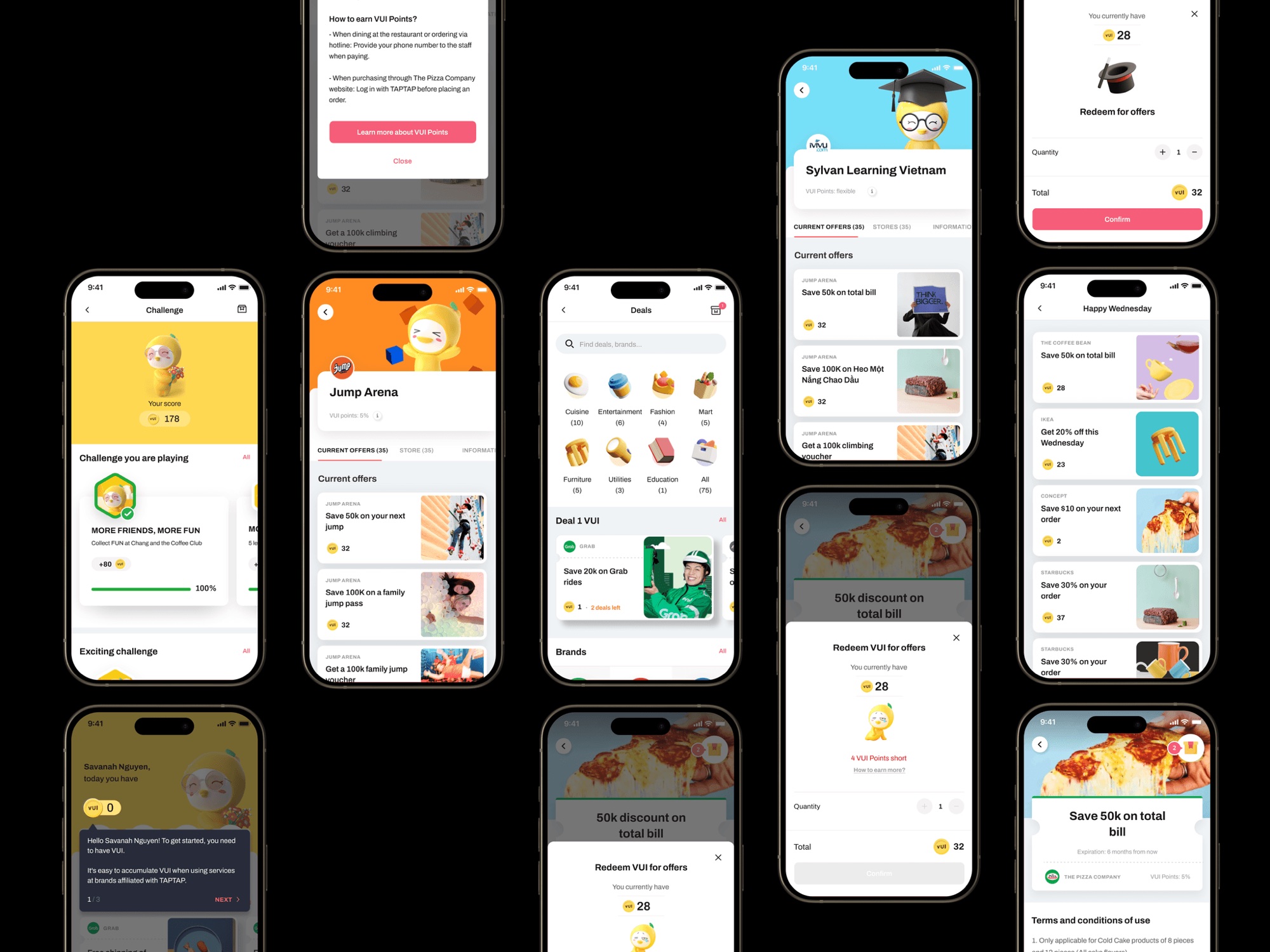
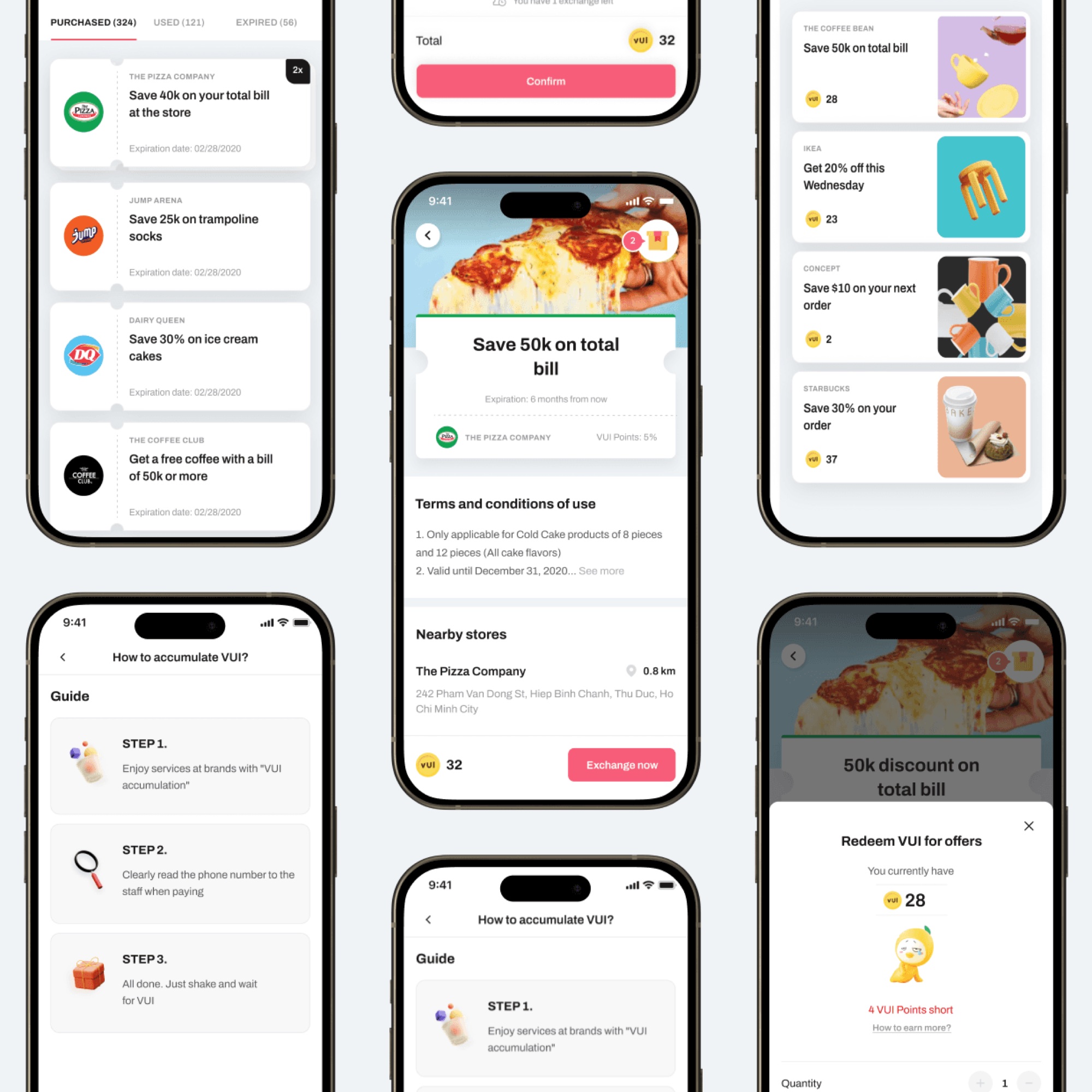
From the deal list to the redeem screen.
Brand system
Loud colour, strict rules.
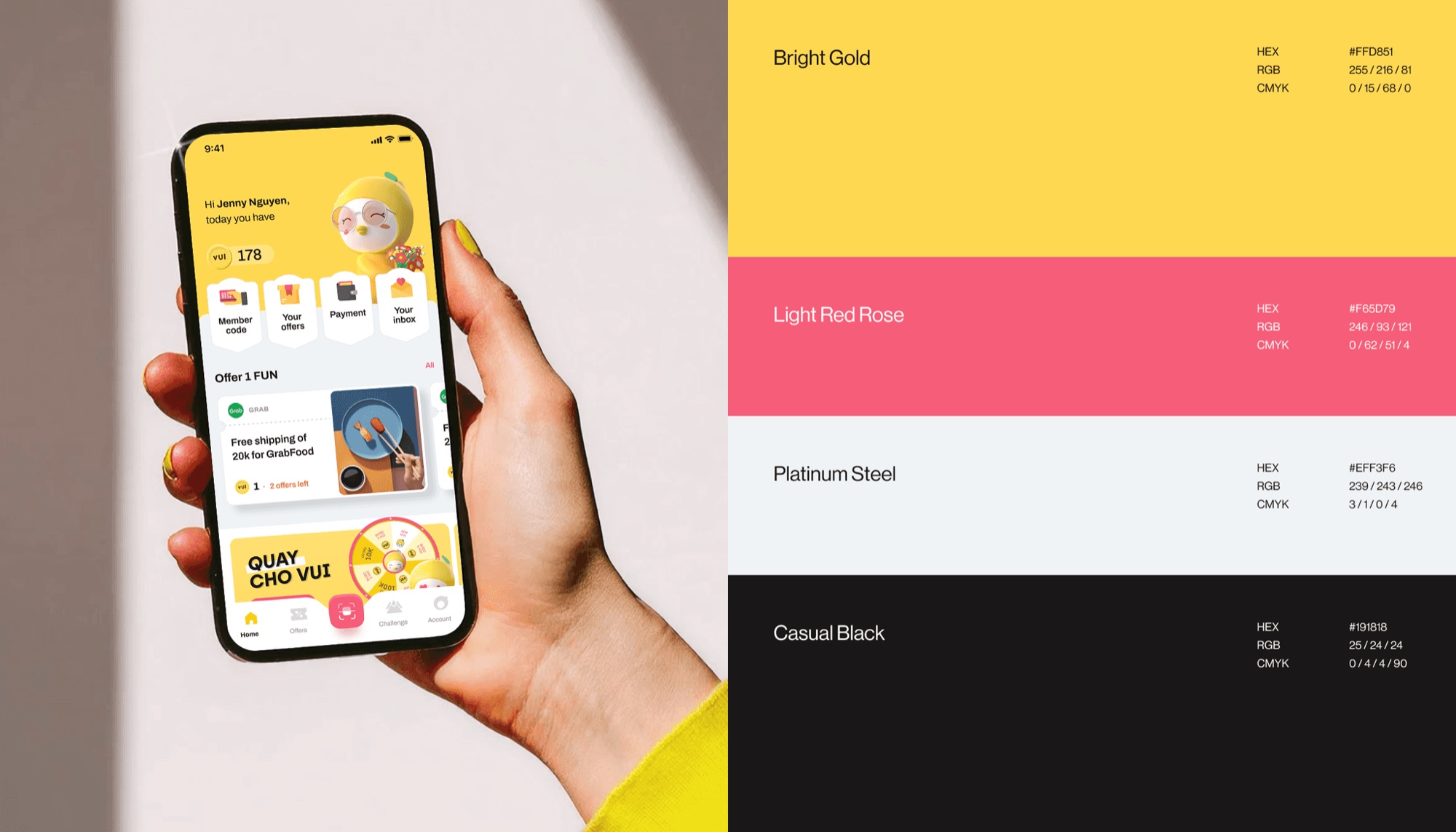
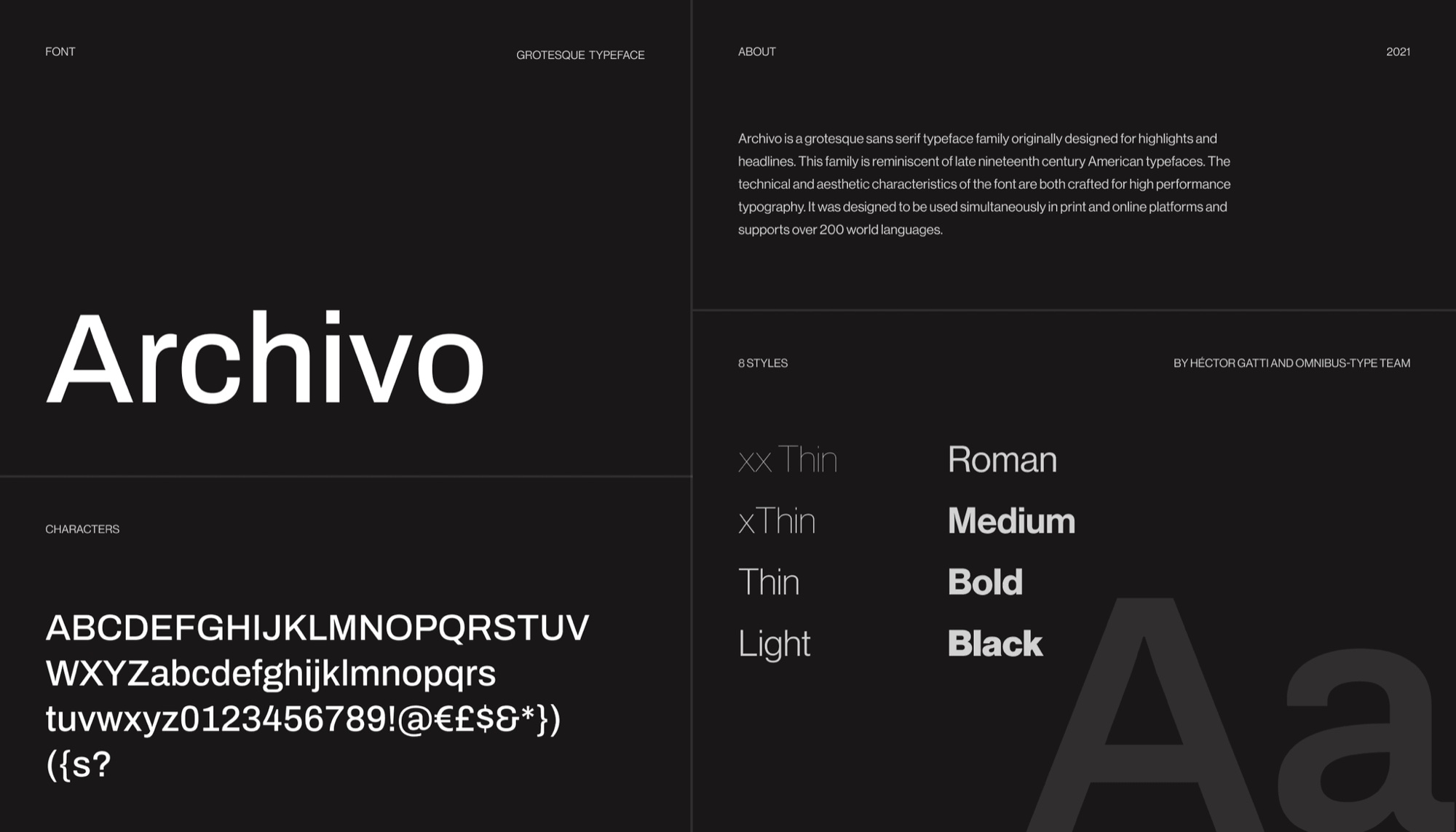
Bright Gold and Light Red Rose for action and reward. Platinum Steel and Casual Black keep the rest calm. Archivo carries every weight.
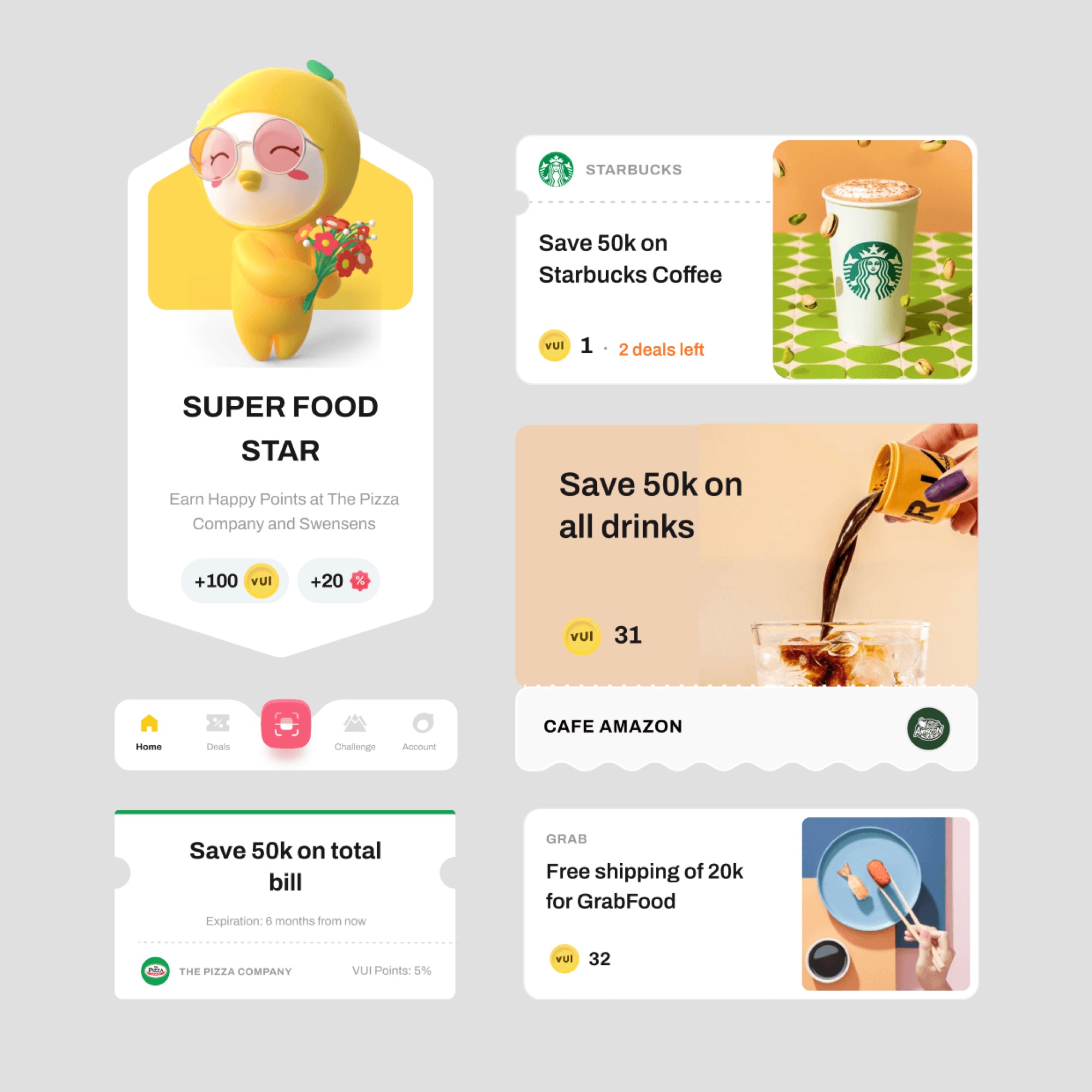
Deal cards: one layout for every partner and campaign.
Gamification
Motivation without the clutter.
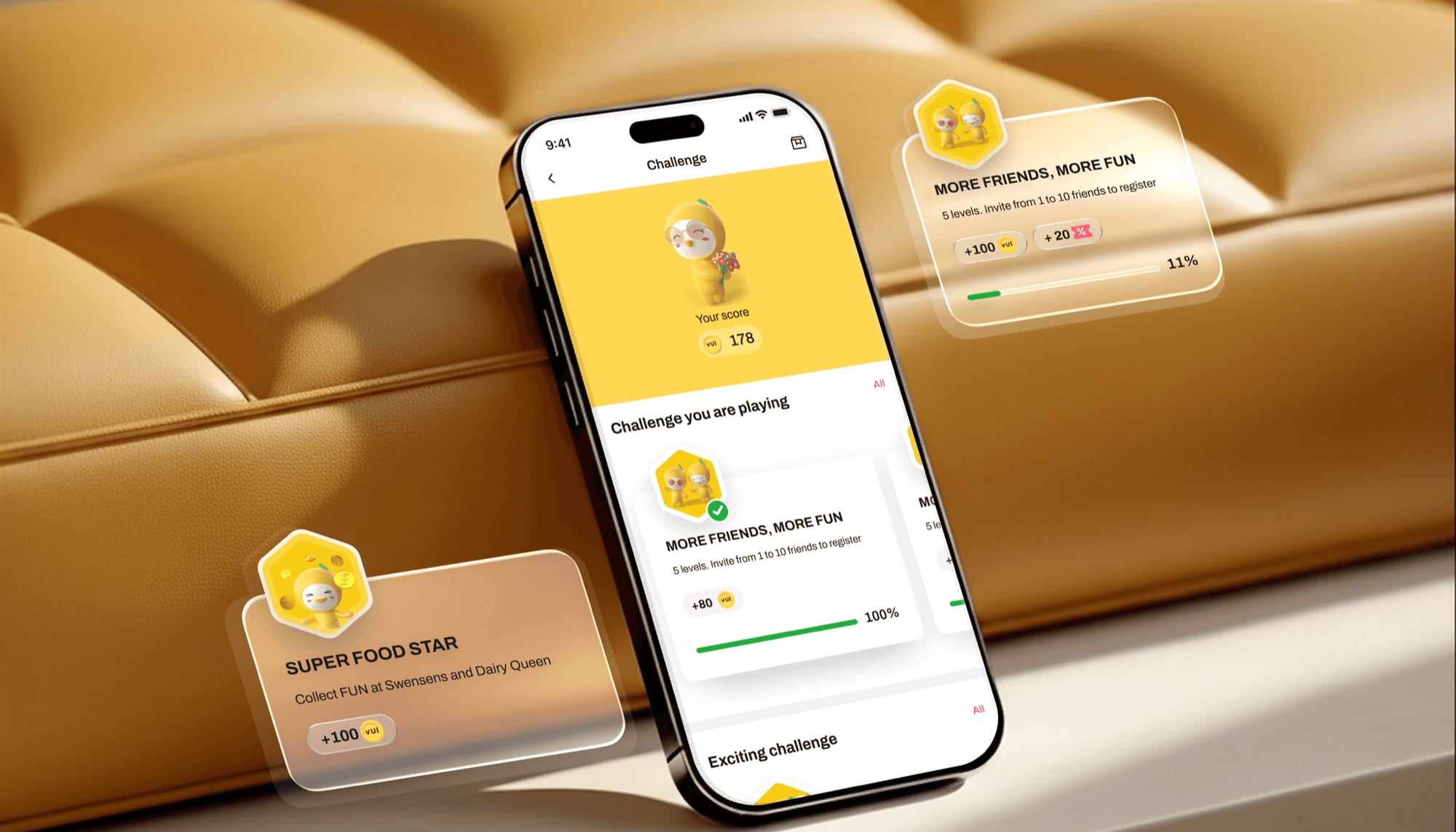
Challenges, progress bars and reward states sit inside normal screens. They reward attention without adding steps.
Browser rebuild of the challenge pattern.
Impact
Clearer rewards, more reasons to come back.
What changed for users and for the team running campaigns.
More confidence in rewards
Clearer reward flows improved user confidence and engagement.
Motivation, not complexity
Gamification raised motivation without adding steps.
Faster campaign launches
Reusable UI patterns let the team launch campaigns quicker.
Room to grow
Patterns ready for new rewards and gamified features.
Designed by Huy Pham, founder of PHAXIS Lab, as a senior contractor for TAPTAP.
Huy Pham
Huy Pham
TAPTAP team
TAPTAP team
Mobile app
Archivo
Running a consumer app?
Get a design team that ships the fun parts too.
Next case